
Deliveries were consistently late, but no one could see where or why.
DataCo Global's supply chain data contained over 180,000 records across 53 columns, but there was no analytical layer on top of it. They didn't have the visibility to understand which regions, shipping modes, or customer segments were driving the problem.
I built a Tableau dashboard to answer that question: where are the systemic bottlenecks, and what's actually driving late delivery risk?
How can we identify and reduce late delivery risk across DataCo's supply chain?
Skills Demonstrated
Refining 53 columns into a clean, analysis-ready dataset.
The raw dataset had 53 columns. Many were redundant, poorly named, or irrelevant to delivery performance. I processed it in Python: addressed missing values, removed 12 unnecessary columns, and renamed fields for clarity ("Type" became "Payment Type"). I also extracted date components to enable time-based analysis.
After preprocessing, I ingested the cleaned dataset into a MySQL database for efficient querying and integration with Tableau.
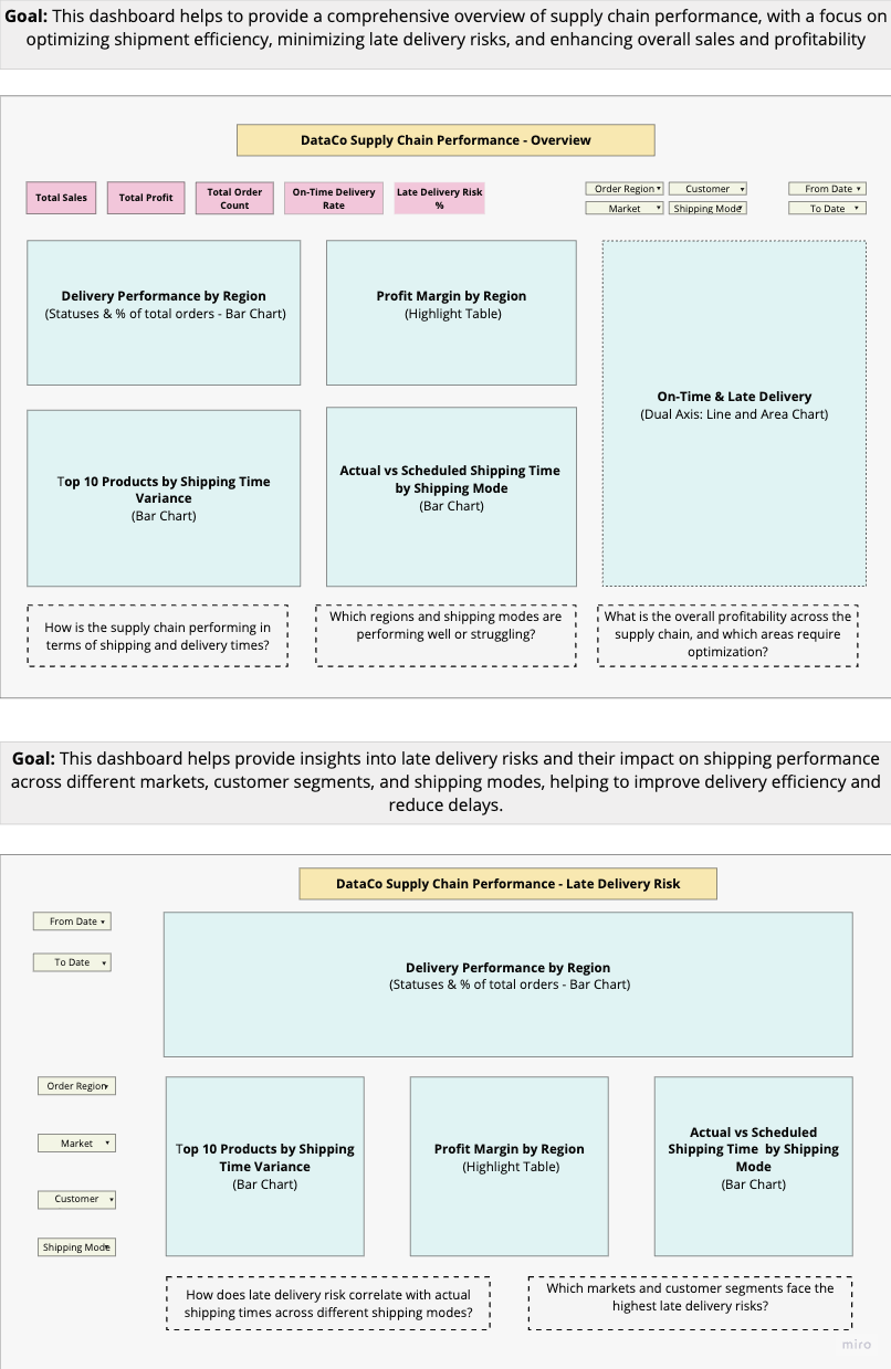
Lo-fi dashboard flowchart designed on Miro — mapping the data preparation and visualization pipeline.
An overview for the big picture, a detail view for root causes.
I structured the analysis as two complementary dashboards. The first provides a high-level health check across regions, profitability, and shipping performance. The second isolates late delivery risk and examines it across time, markets, segments, and shipping modes.
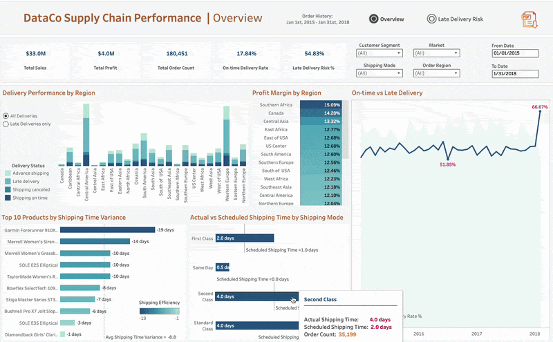
This dashboard gives a high-level read on supply chain performance across shipping, delivery, regional efficiency, and profitability. It's designed so stakeholders can spot strong performance areas and potential bottlenecks quickly. The dashboard flows from regional and financial performance into shipping performance, letting stakeholders assess overall health before drilling into specifics.
- 1 How is the supply chain performing in terms of shipping and delivery times?
- 2 Which regions and shipping modes are performing well or struggling?
- 3 What is the overall profitability, and which areas require optimization?
Visuals included: Delivery Performance by Region (bar chart), Profit Margin by Region (highlight table), On-Time & Late Delivery trend (dual axis), Top 10 Products by Shipping Time Variance (bar chart), Actual vs. Scheduled Shipping Time by Shipping Mode (bar chart).
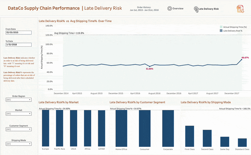
This is where root cause analysis lives. The detailed dashboard isolates late delivery risk and examines it across multiple dimensions.
This visualization shows the correlation between shipping delays and late delivery risk. As actual shipping times exceed scheduled times, late delivery risk climbs. I added a reference line at 119%, indicating that on average, shipments take 19% longer than scheduled. When shipping time exceeds this line, it points to operational inefficiencies contributing to more late deliveries.
This breaks late delivery risk across three dimensions simultaneously, revealing which combinations of market, customer type, and shipping method are most vulnerable. It turns a broad problem ("deliveries are late") into a targeted one ("Standard Class shipments to Consumer segments in Western Europe have the highest risk").
Filters: From Date, To Date, Order Region, Market, Customer Segment, Shipping Mode.
Five KPIs that anchor the analysis.
What the data revealed.
Late deliveries appear consistently across all regions. However, Western Europe (55.85%) and Central America (54.75%) have the highest rates, making them priority targets for operational intervention.
Southern Africa leads with a 15.09% profit margin, while Eastern Asia trails at 11.05%. This gap suggests regional supply chain inefficiencies are eroding margins in underperforming areas. Improving delivery performance in these regions could directly lift profitability.
The Garmin Forerunner showed the lowest shipping time variance (closest to the -1 day reference line), but it still experienced delays. If the best performer can't hit scheduled times consistently, the issue is structural, not product-specific.
Late delivery rates spiked to 66.67% while on-time delivery dropped to just 15%. This kind of acute deterioration points to operational bottlenecks or unexpected demand surges that would warrant immediate investigation in a live environment.
The full dashboard is live on Tableau Public with interactive filters. View Live Dashboard →